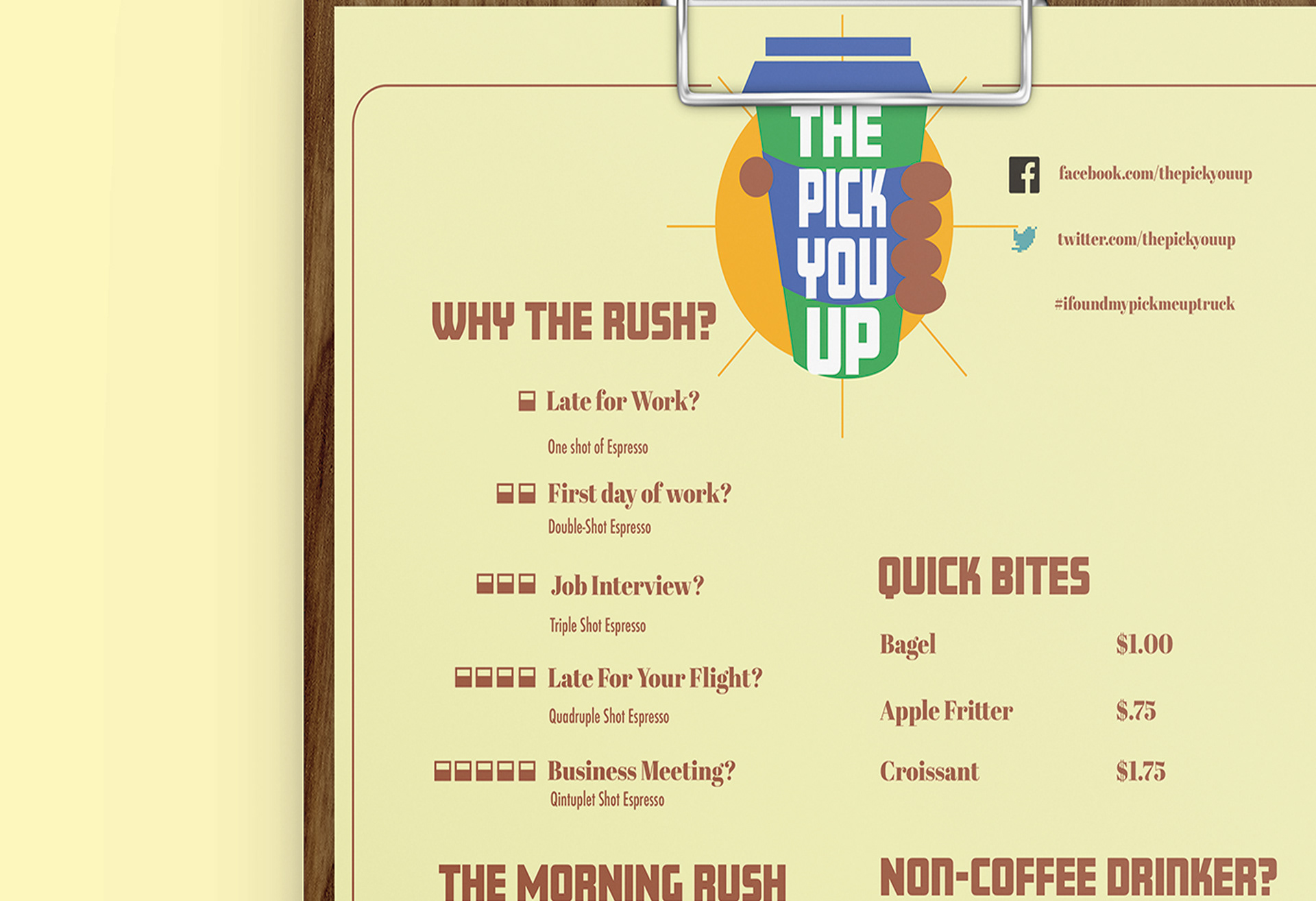

For the "Pick-You-Up" Logo, I wanted the project's brand to have a playful feel to it. The identity highlights a busybody's need to rush to get their coffee and get straight to work. The green is meant to represent the energizing feel of coffee while the blue in the middle is meant to represent reliability in knowing full well that your coffee will be made the way you want it!

Preliminary sketches for the official "Pick-You-Up" Logo. Some key elements I played around with were elements of speed like visible speed lines or a running cup of coffee. I wanted to create a sense of urgency with the brand, like you'll get your coffee and you're gonna get it FAST.
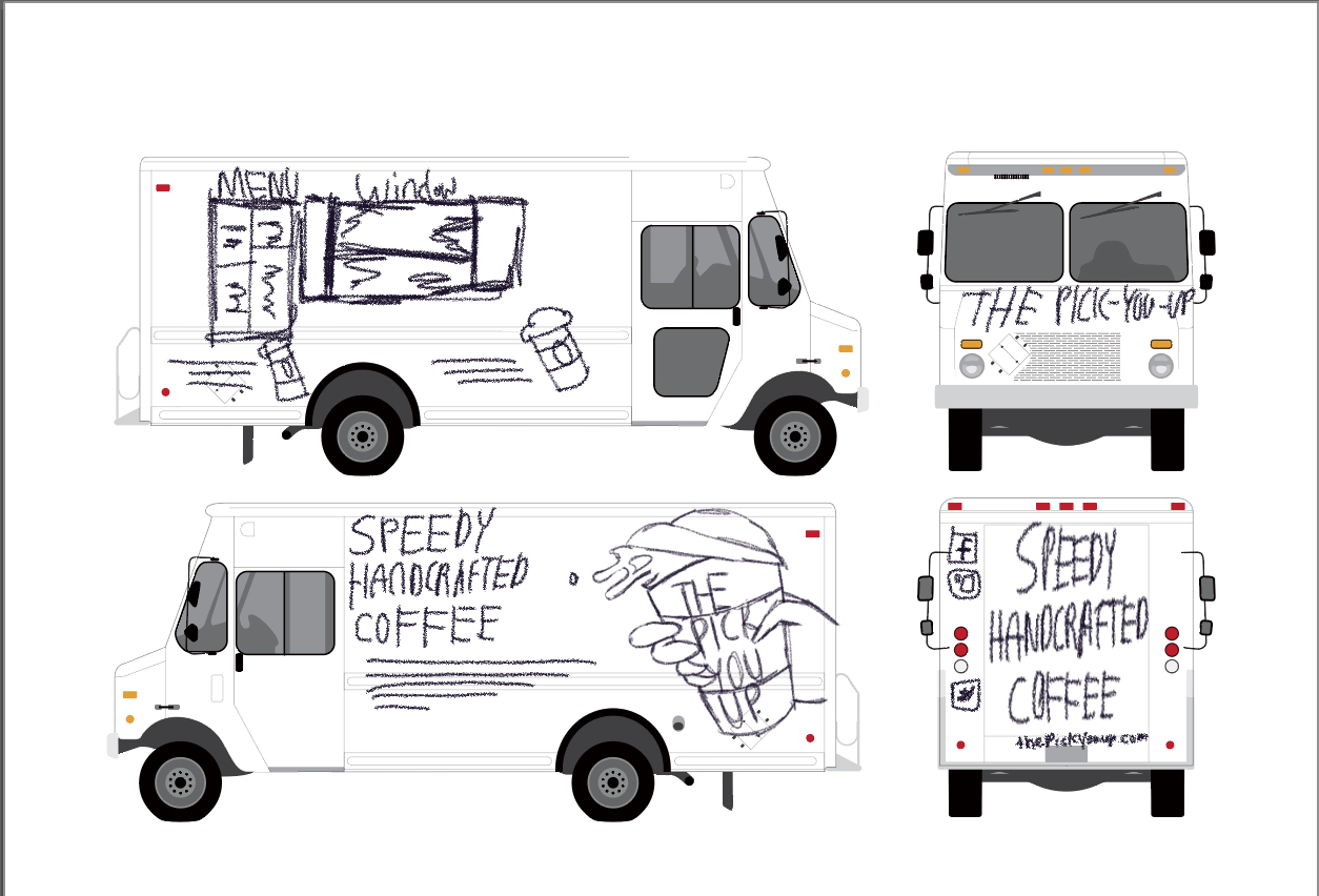

Food truck concept sketches and Menu design concept
Mockups
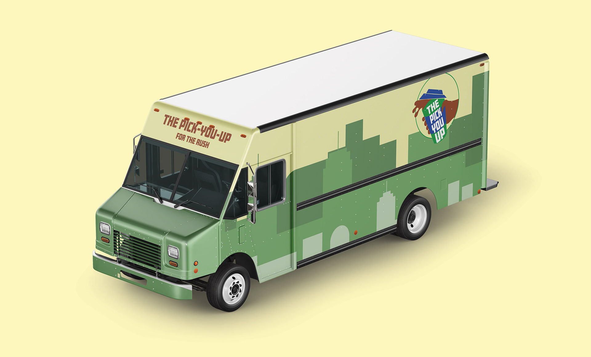
The-Pick-You-Up Food Truck, 3/4 Bird's Eye View
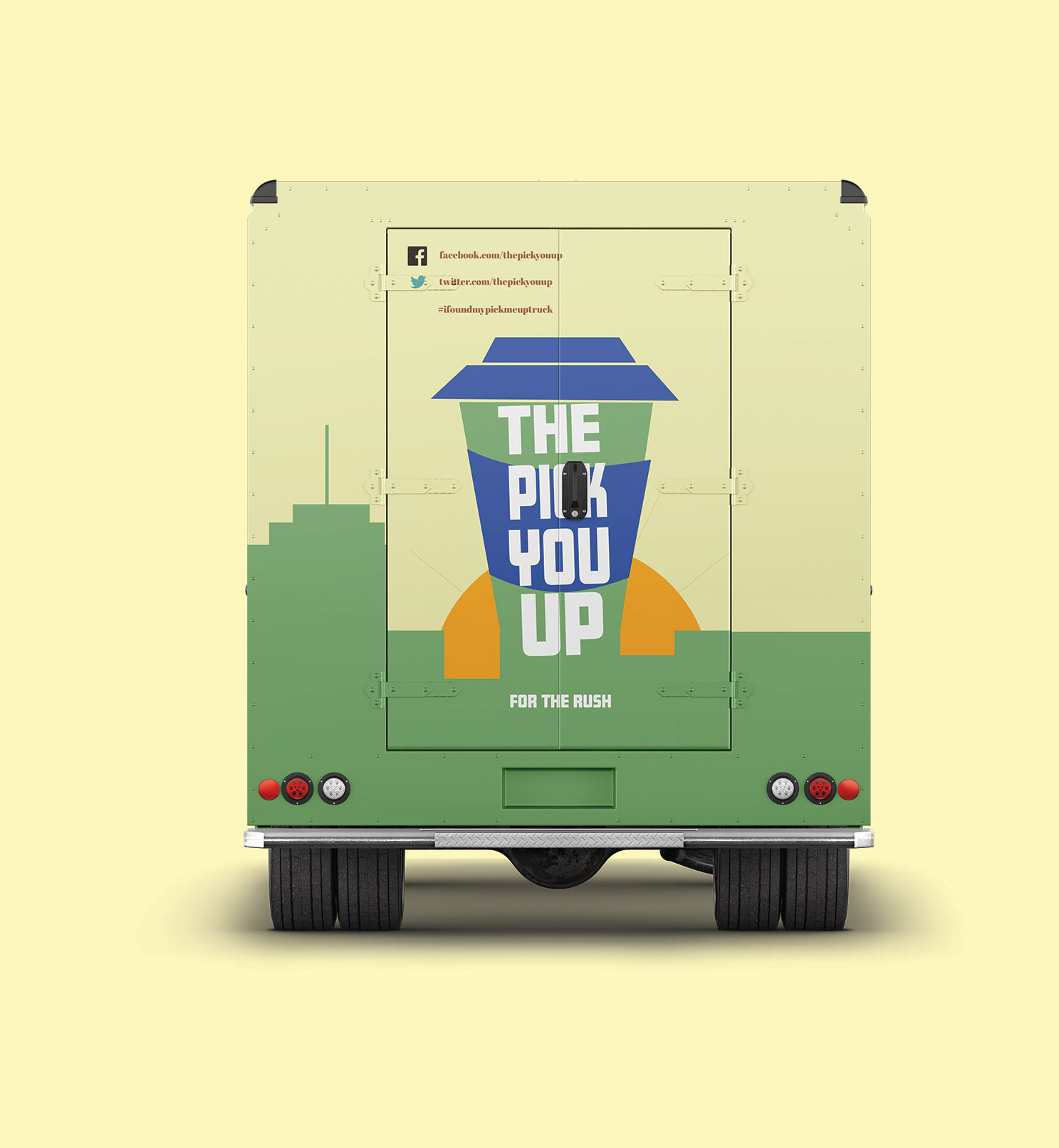
Rear View
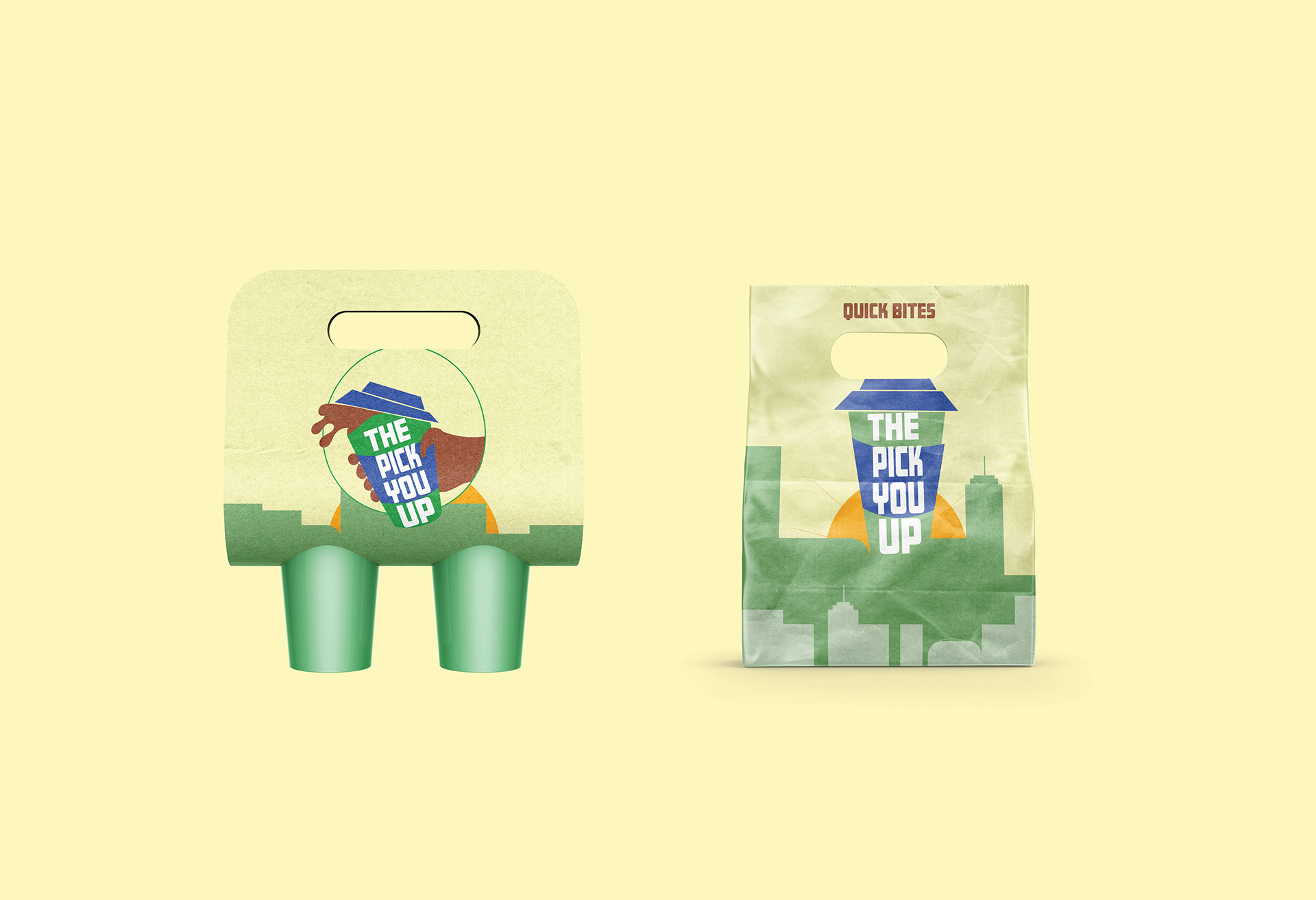
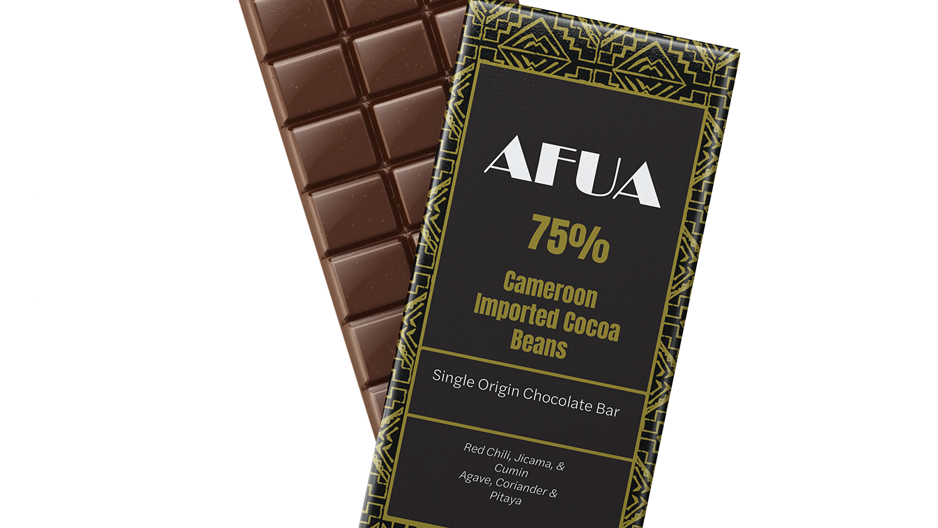
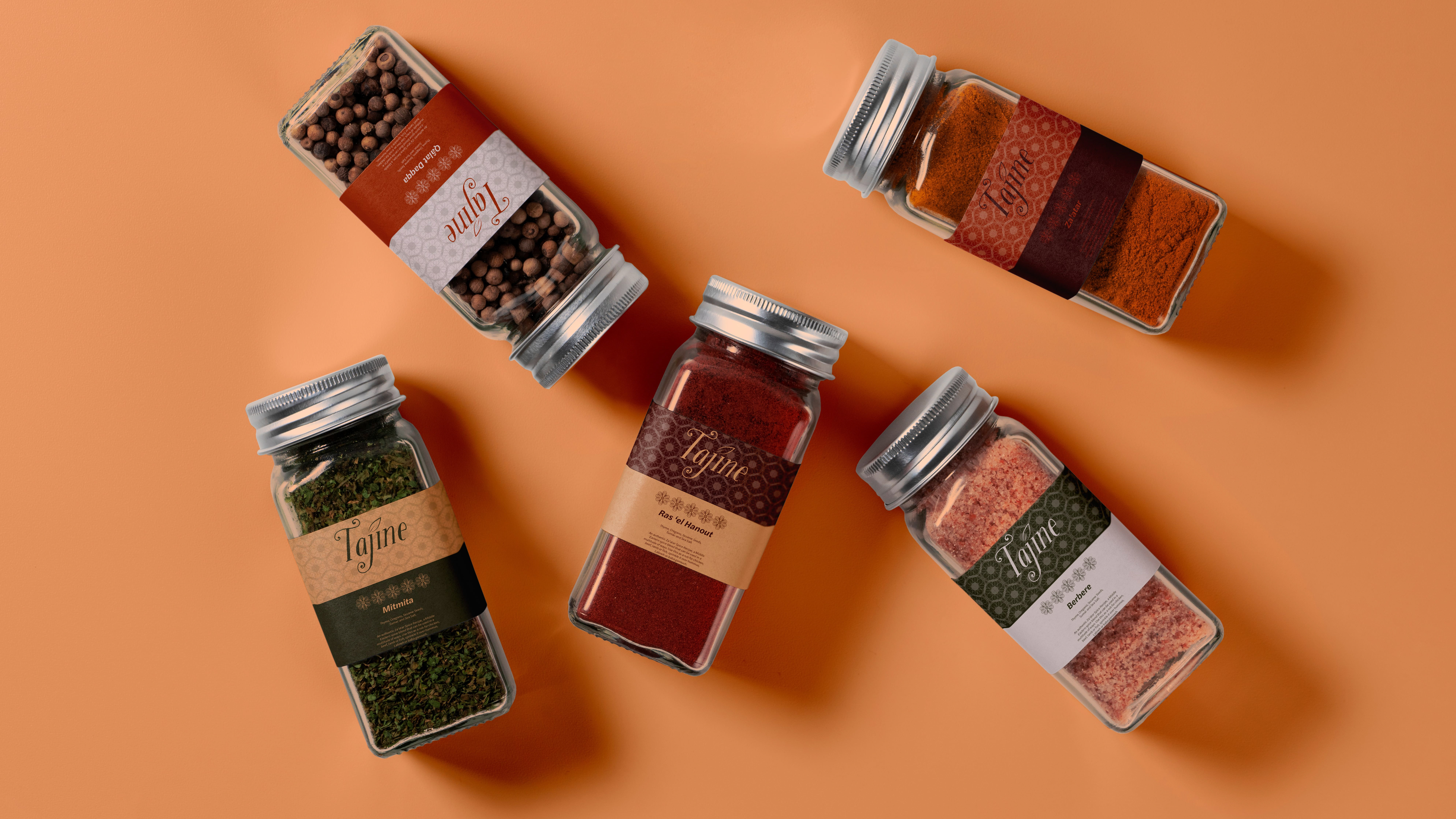
Food and Beverage packaging
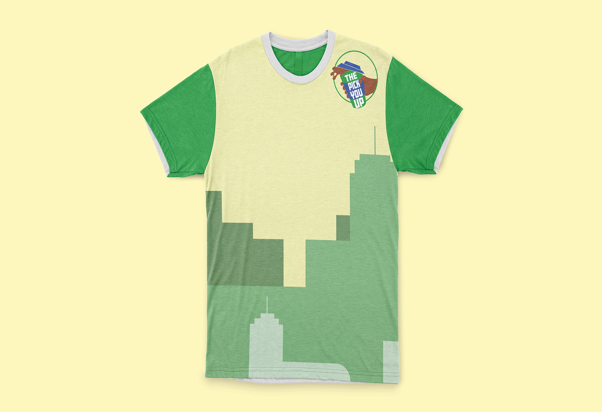
T-shirt Mockup
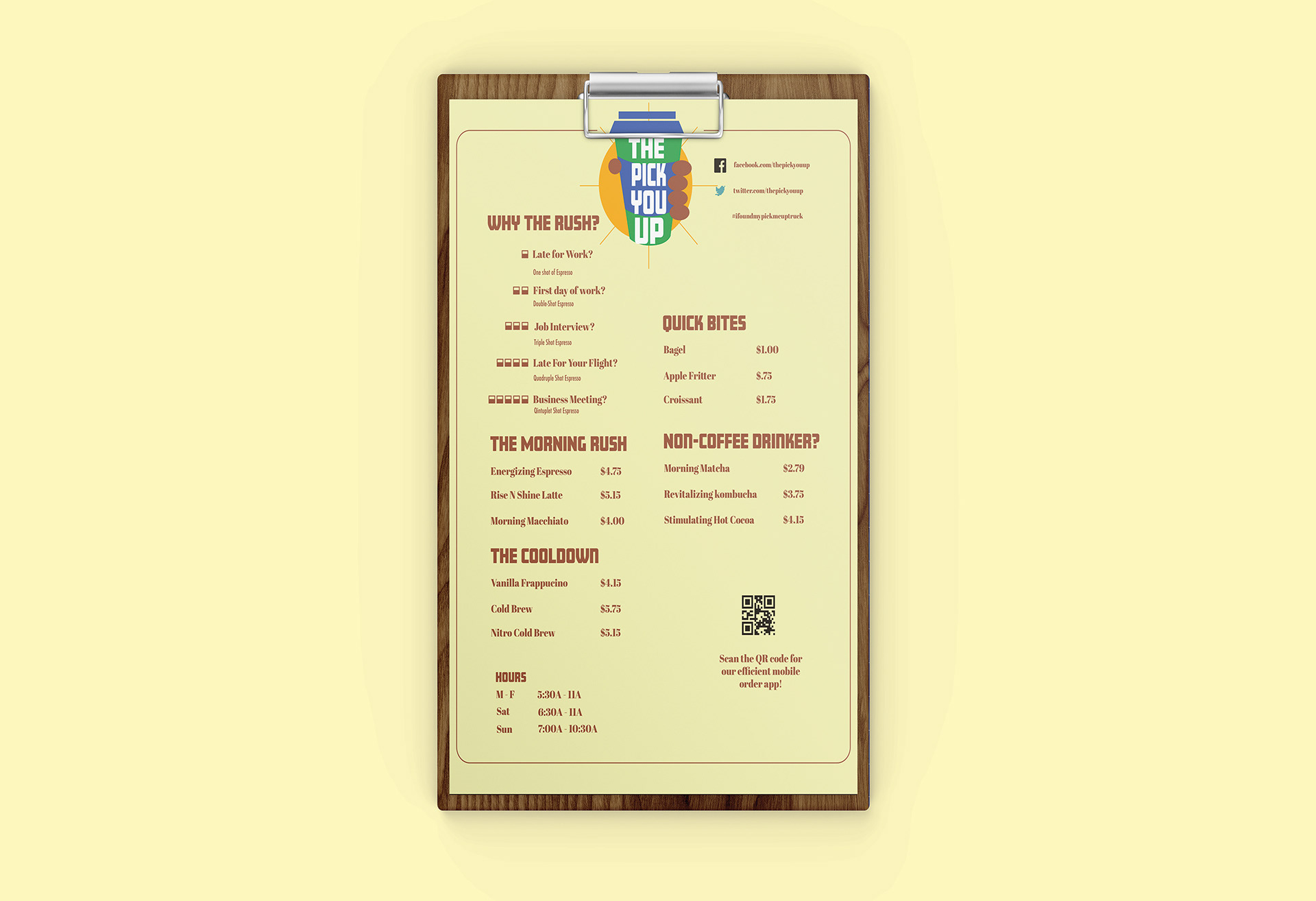
Official Menu