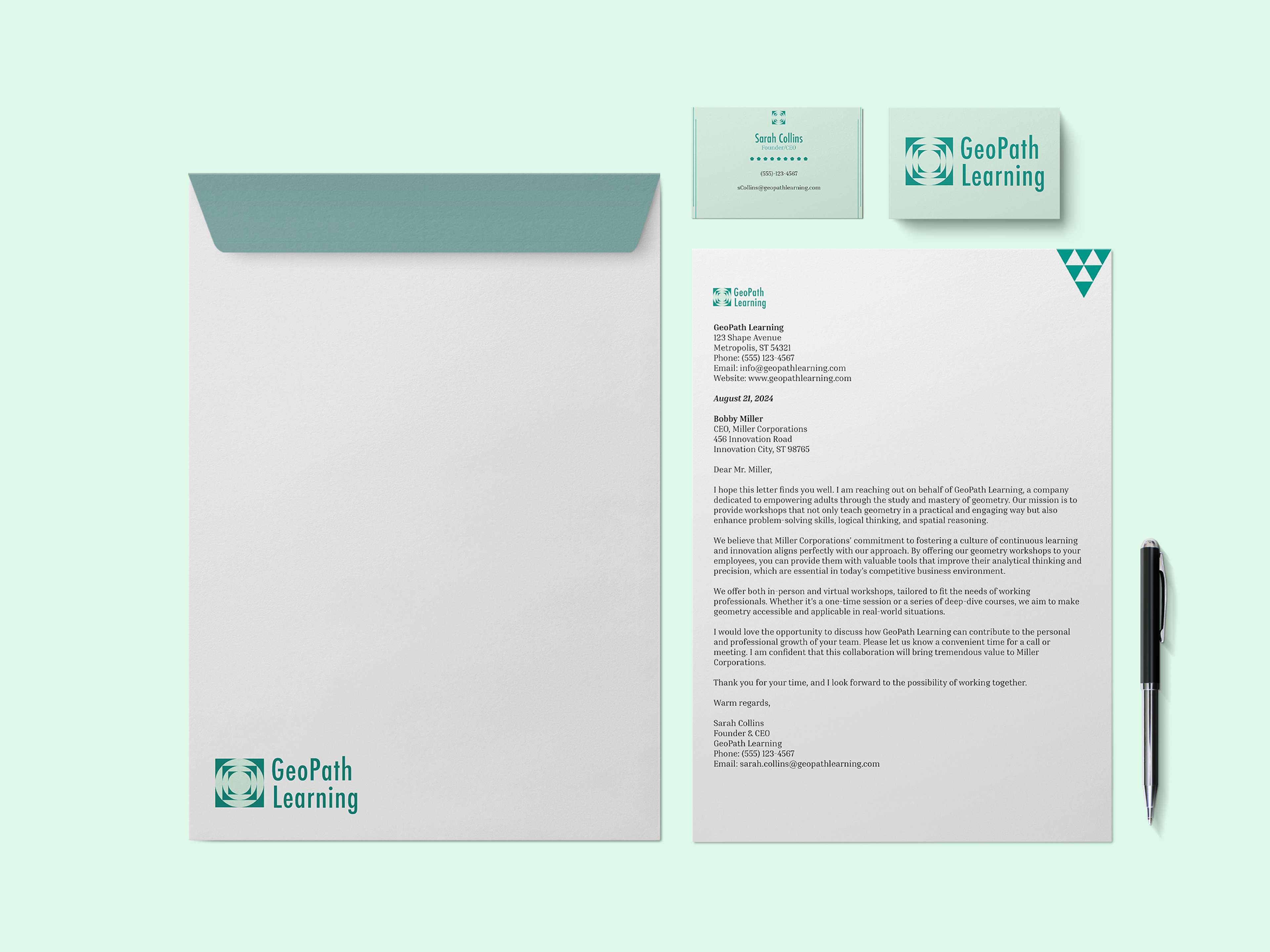
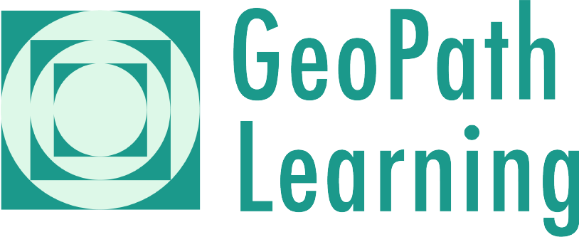
For the project's official logo, I created a simple, geometric logo with a bit of complexity.
The circles represent the unification of the learning process and the squares represent structure and reliability.
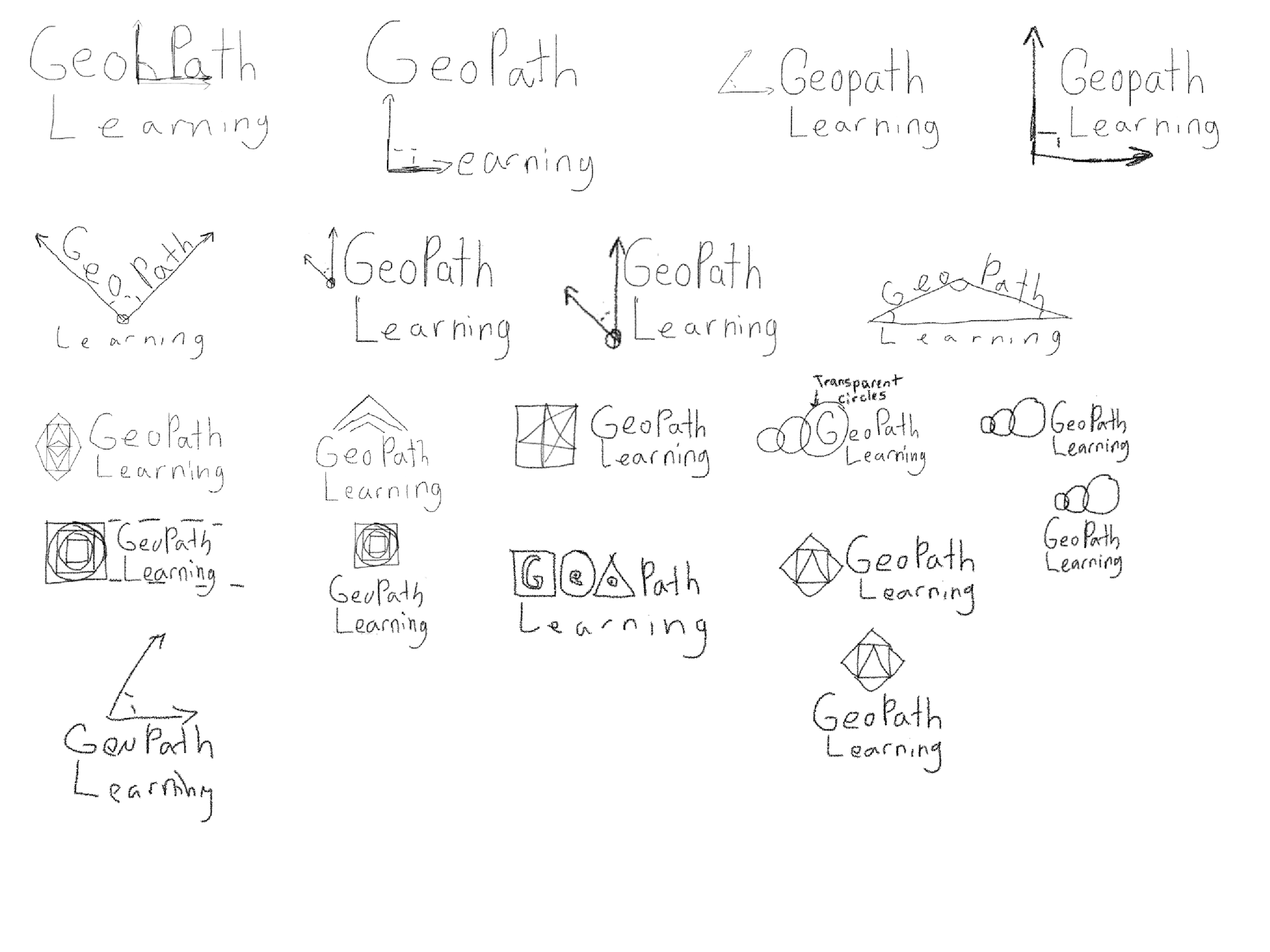
My strategy consisted of finding various geometrical shapes that could fit into the mold of a logo mark without having it look too generic or too obvious.
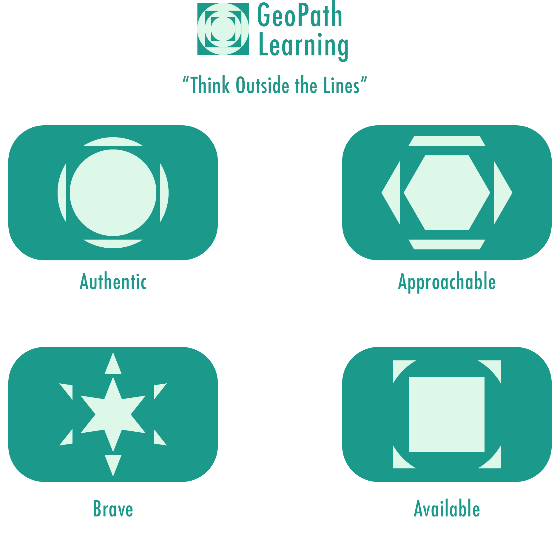
The Brand Voice is something I also wanted to emphasize with this project utilizing the keywords that I highlighted within the original prompt.
I also came up with the tagline "Think Outside the Lines" as a way of differentiating the brand from its other competitors by putting emphasis on its approachable-ness.
Mockups
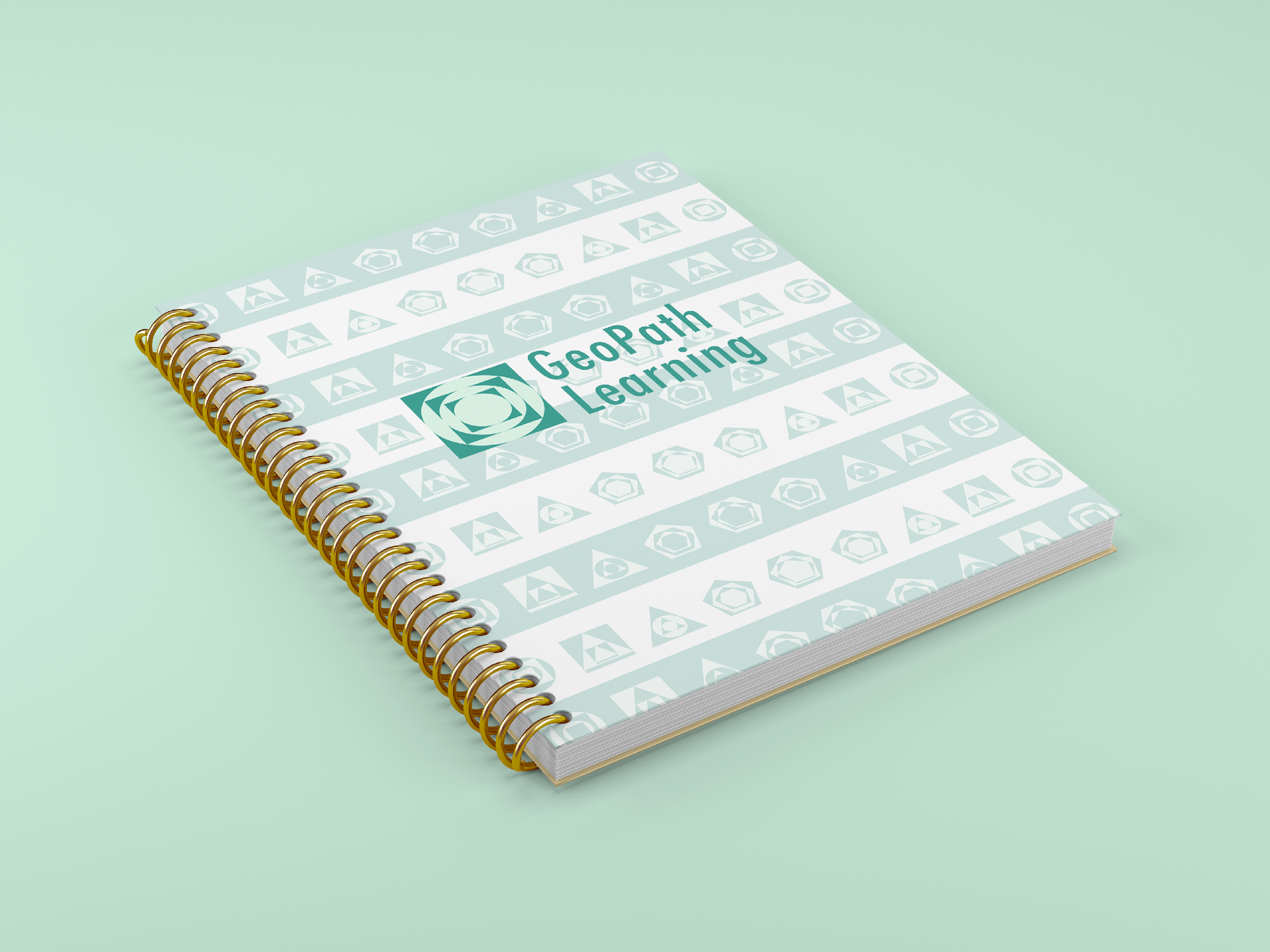
Branded Notepad

Drawstring Bag